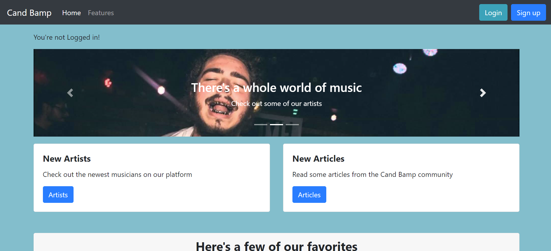
Cand Bamp
March 8, 2021 - Django, Python
This project was inspired by Band Camp. My partner's and I worked on this for 2 week. The project is to inspire artist to post articles about their new song and to add their song. The website makes the user login, signup, add music/article, comments and add picture's to their profile and music album. Most of the website features has authentication to keep other users from editing things that's not theirs. The user can follow other user and like their article/music post.
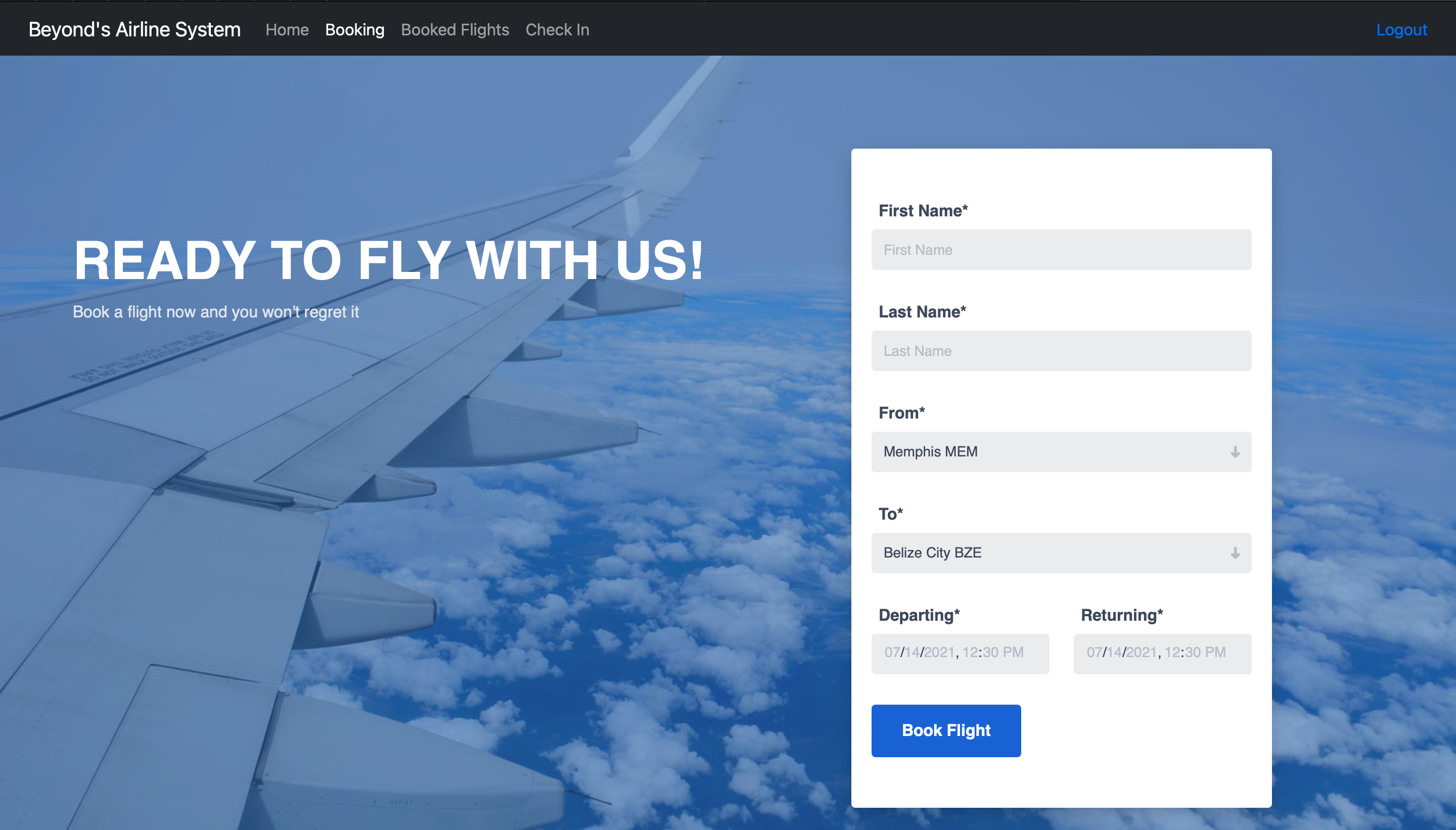
Beyond's Airline
June 7, 2021 - Java, Spring, Mariadb
A project that I wanted to build for a long time. The motivation to this project was me booking a flight and I wanted to see what happens behind the screen. It took me 4 weeks to work on this while learning Spring. Since all the user information is stored in a database it made it easier to signup and login. The landing page is just to greet you but the homepage is where you can book and check your flights. After booking the user will be prompt to a revise page to edit or submit the flight.

Shelf Wear
July 12, 2021 - Django, Python, Stripe API
Shelf Wear is inspired by big online shopping companies like Amazon, American Eagle and Old Navy. Which are ecommerce website so it's a similar approach to Amazon website. User can login and signup. Roles like Buyer and Seller are available in the signup. User can add items to their favorites and update their account. Once a item is added to the shopping cart, the price is recalculated. Stripe API is used to checkout the items with coupons.
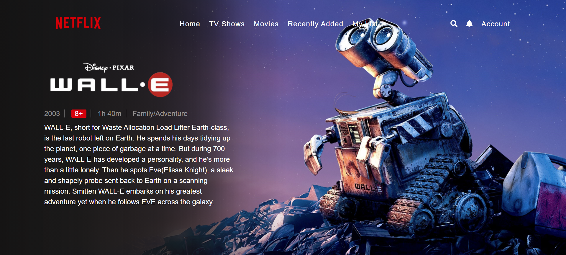
Netflix Landing Page
February 22, 2021 - HTML/CSS
This Wall-e netflix landing page was built mostly on CSS. The eye catching thing about this website is the background content fading into image. This was built by linear-gradient and many other color variables. Little things like the the age recommendation, age, release date span is amazing. The navbar has the netflix logo and some navigation links along with the search icon, notification bell and account.
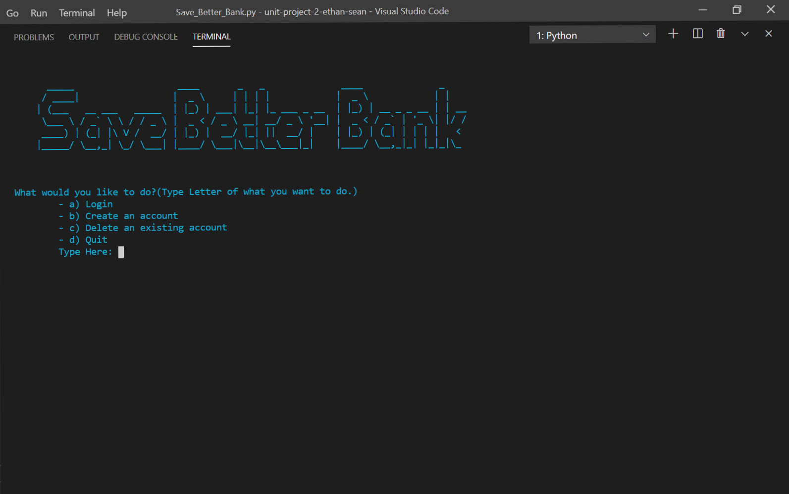
Banking System
November 9, 2020 - Python, SQL
This program is a mock banking system. Where you can deposit, withdraw and add money into your savings account, which are all done by classes. Little features like view balance, delete account and change password makes with program great. How is it done you may ask! Well the features are done inside a function and a while loop gives the user option to choose from. All data is stored into a database so user information is secured.
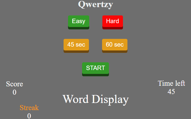
Typing Test
April 19, 2021 - HTML/CSS, Javascript
This typing test was paired program which the motive was to test your typing skills. This was done in Javascript to test our skills to see if we knew the content. The game has animations which brings the game to life. All the words are randomized through an arraylist. The timer was a set interval to countdown and update the html timer tag. A timer animation is included after 10 seconds. The buttons are toggle by using the Dom.
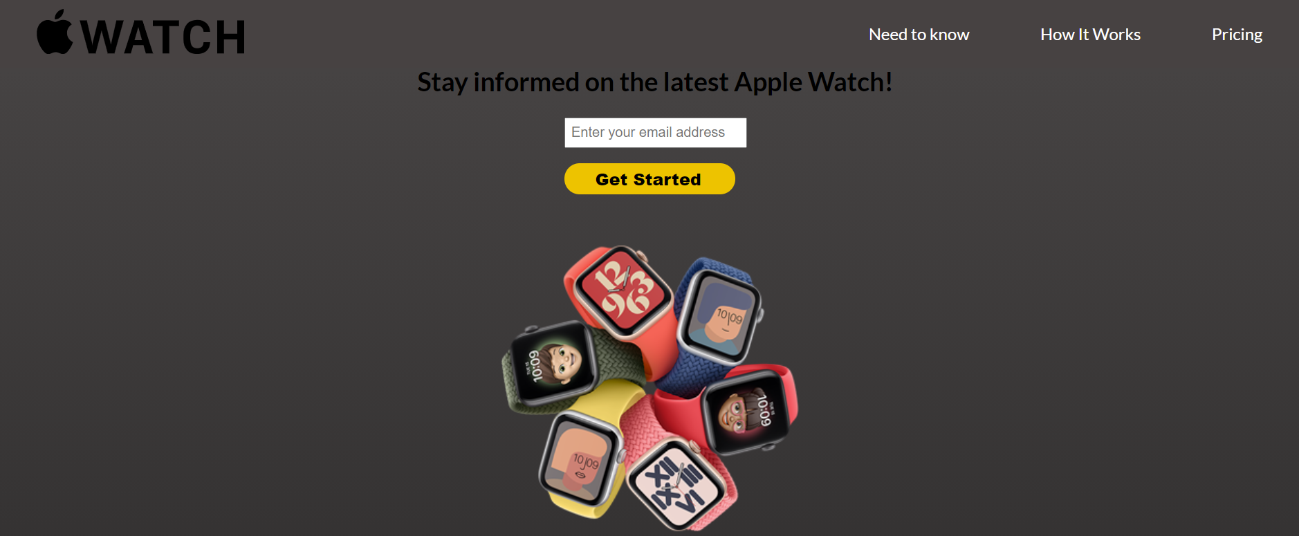
Product Page
January 23, 2021 - HTML/CSS
This website is Apple Watch products landing page that has links so you can buy straight from the apple website. The landing page includes some detail about the company and the products.
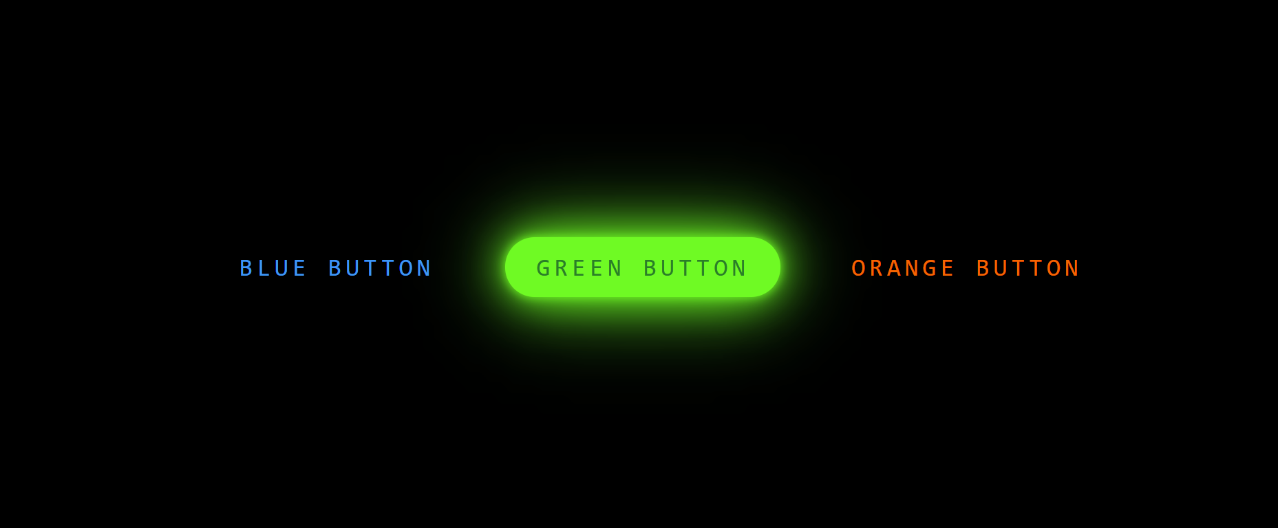
Neon Buttons
January 8, 2021 - HTML/CSS
This website has buttons that glows in the dark as you hover over them. It is done by transitions and border showdows in CSS. Wanted to do this website to get practice on CSS.